
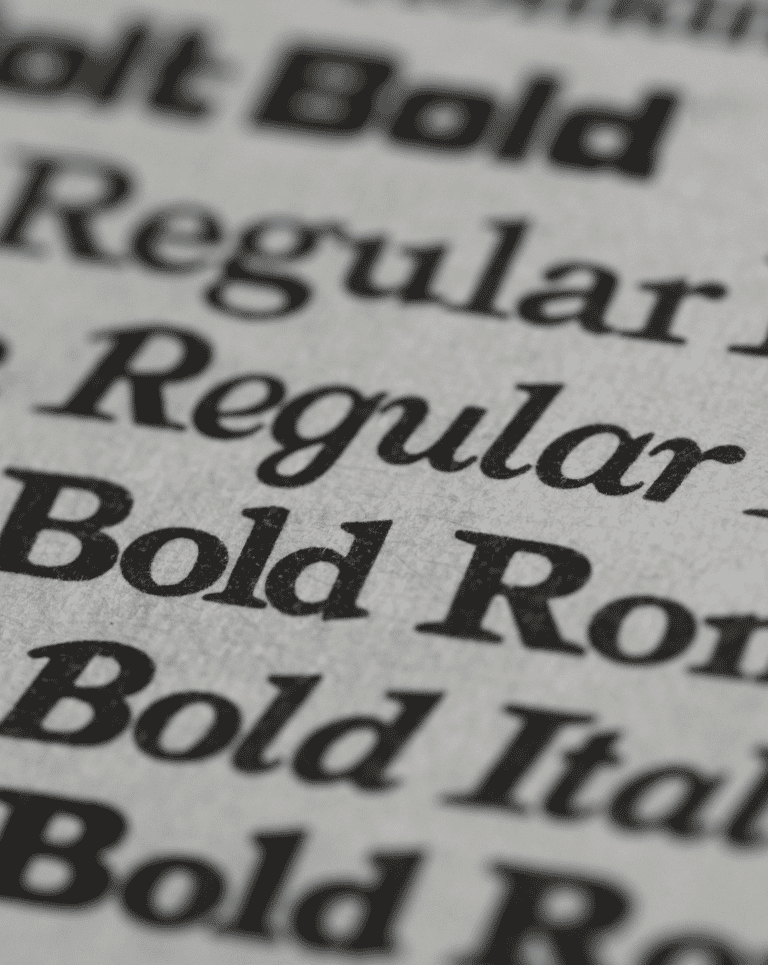
Your website’s typeface is doing more work than you think. Before a visitor reads a single word of your copy, the shape of your letters has already told them whether your business feels trustworthy, modern, playful, or outdated. In fact, design elements like layout, color, and typography drive 94% of people’s first impressions of a website. That is not a small detail to leave to default settings. This post breaks down how to choose a font for your website, where to find one, and the mistakes that quietly undercut good branding.
Why Your Font Choice Matters More Than You Think
Typography is one of the fastest signals a visitor picks up on, and it happens before they process anything you have actually written. A rounded, casual font tells a different story than a sharp, geometric one, even if the words underneath are identical. Learning how to choose a font for your website starts with understanding this: it is brand expression at the most basic level, and it should be treated with the same intention you would give your logo or color palette. If your team has not already documented font choices as part of your visual identity, it is worth building that into your brand guide so every designer, developer, and freelancer who touches your site stays consistent.
System Fonts vs. Web Fonts: How to Choose a Font for Your Website
Every computer comes with a short list of system fonts already installed, things like Arial, Georgia, or Times New Roman. They load instantly and always display correctly, but that reliability comes at the cost of personality.
Web fonts solve this. Instead of depending on what is already installed on a visitor’s device, a web font is hosted on a server and downloaded by the browser when someone visits your page. Your site references it using the CSS @font-face rule, which tells the browser where to find the font file rather than embedding it directly. Most web fonts ship in several formats (.woff, .woff2, .ttf, .otf) so they render correctly across browsers and devices. This is the modern standard, and it has fully replaced older, Flash-dependent embedding tricks that used to be common a decade ago.
How to Choose a Font for Your Website: A Simple Framework
- Start with your brand personality. A law firm and a children’s toy brand should not be reaching for the same typeface. Decide what feeling you want a visitor to have in the first three seconds, then let that guide your search.
- Prioritize readability over novelty. A font that looks striking in a mockup but strains the eyes at body-text size will hurt engagement no matter how on-brand it feels. Test any candidate font at the actual sizes it will run at on desktop and mobile.
- Limit yourself to two or three fonts. One for headlines, one for body copy, and an optional third for accents or buttons. More than that and your site starts to feel visually cluttered.
- Check the license before you use it. Every font comes with an End User License Agreement (EULA) that spells out what you can and cannot do with it, including whether it is cleared for commercial or web use. Skipping this step can create real legal headaches later.
- Confirm cross-device performance. A font that looks sharp on a retina display can turn thin or hard to read on an older monitor. Preview your shortlist on a few different screens before committing.
Where to Find Great Web Fonts
Part of learning how to choose a font for your website is knowing where to actually look. You do not need a custom type foundry to find something distinctive. Google Fonts remains the most popular free option, with hundreds of open-source families you can license and load through CSS. Adobe Fonts, bundled into Creative Cloud plans, offers a larger curated library with more premium options. Sites like Fontsquirrel specialize in fonts cleared for commercial use at no cost, while foundries like YouWorkForThem sell one-off licenses for more distinctive, less commonly used typefaces if you want something competitors are less likely to be using.
Common Mistakes to Avoid
One of the most common mistakes teams make when figuring out how to choose a font for your website is picking one because it looks good on a homepage hero image, then never testing it in a paragraph of real body copy. Another frequent misstep is skipping the license check, only to learn later that a “free” font actually requires a paid commercial license once the site is live. Teams also tend to add too many fonts as a project evolves, with each new designer introducing another typeface that was never meant to sit alongside the others. That kind of drift is exactly what a documented brand guide is meant to prevent, and it is one of the reasons measuring design effectiveness over time matters just as much as picking the right font on day one.
How Typography Fits Into Your Bigger Marketing Picture
Font choice does not exist in a vacuum. It is one piece of a visual identity that includes your logo, color palette, photography style, and voice. Get it right and it reinforces everything your brand is trying to say. Let it drift inconsistently across your website, social channels, and print materials, and you dilute the recognition you have worked to build. Businesses that maintain a consistent brand identity across every channel see measurably higher revenue than those that do not, which makes a typeface decision a business decision, not just an aesthetic one.
Frequently Asked Questions
What is the difference between a typeface and a font? A typeface is the overall family of letterforms, like Helvetica or Georgia. A font is one specific style within that family, such as Helvetica Bold at a particular size. Most people use the terms interchangeably, but it is worth knowing the distinction when briefing a designer.
How many fonts should a website use? Two or three is the practical limit for most sites: one for headlines, one for body copy, and an optional accent font for buttons or callouts. Adding more than that tends to make a site feel visually inconsistent rather than more distinctive.
Are web fonts free to use commercially? It depends on the font and the source. Google Fonts and Fontsquirrel both offer libraries cleared for free commercial use, but plenty of premium fonts require a paid license, especially for embedding on a website. Always check the EULA before publishing.
Do fonts actually affect website conversions? Yes. Typography influences readability, trust, and how quickly a visitor understands your message, all of which affect whether they stay on the page or convert. It will not fix a broken offer, but a hard-to-read or off-brand font can quietly cost you engagement.
Now that you know how to choose a font for your website, treat it as a brand decision rather than a design afterthought. It shapes how visitors perceive you before they read a single word. If you want help making sure your typography, and the rest of your visual identity, is working as hard as it should be, let’s talk.