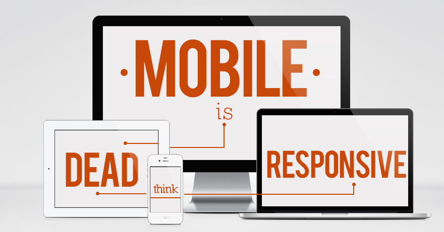
That feeling when you create an awesome full-width layout for your website. 🙂
And then you look at it on mobile. 😐
When I first started creating for the web, mobile design gave me a reality check. I treated it like an afterthought, something I could clean up later. But I’ve come to realize that this system is not ideal!
According to Statista, “Over 53% of global website traffic comes from mobile devices.” That means more than half of people will see my “good enough” mobile website and maybe never even visit my perfected, overthought, full-screen design.
Mobile Design Matters
No matter how spectacular your full-screen design is, if it doesn’t translate to a smaller device, people will hop off before they can scroll to the content they came there to see. Websites that fail to deliver a seamless experience on mobile devices will lose valuable traffic and conversions.
This isn’t something that consumers take lightly. According to Think With Google, a digital marketing resource, “Mobile-friendly sites have a 67% higher chance of converting users into customers.”
The facts speak for themselves. Optimizing your mobile design allows you to capitalize on this potential for business growth and create better relationships with your customers.
How Can I Fix My Current Website?
If you’ve neglected your brand’s mobile experience, don’t fret, hope is not lost! Many companies are still working toward a seamless mobile experience while testing the boundaries of what people can do on their devices.
Amazon, the top e-commerce provider in the world, has always focused on mobile optimization. In recent years they have implemented responsive design principles, simplified navigation, and enhanced checkout processes to provide a seamless shopping experience on mobile devices.
Ten years ago, making your website “mobile-friendly” was about making sure text and images fit properly on a smaller screen. Nowadays, we are perfecting the use of AI chatbots; testing augmented reality, and using geolocation data to target people personally–all to improve the experience from a mobile device. This may seem like big talk for big brands, but businesses of every size can benefit from improving their mobile device experience.

Getting Started
1. Check the Data
We recommend getting started with a Mobile-Friendly Assessment. Use the Google Mobile-Friendly Tool and Google Search Console to evaluate your website’s mobile performance. These tools provide insights into potential issues and technical suggestions to enhance your site’s mobile compatibility and visibility in search results.
2. Once you have the data, think like a user.
Step into the mindset of a first-time visitor and consider their needs and expectations. Evaluate the user journey and identify pain points. Ensure that key elements such as contact information, customer support, and calls to action (CTAs) are easily accessible and prominently displayed.
3. Optimize Viewing
View your website on various mobile devices, including phones, tablets, small laptops, and desktops. Assess how your site adapts to different screen sizes and identify any usability or visual issues. Determine which device your site looks best on and make necessary adjustments to improve the experience across all devices.
4. Streamline and Prioritize Content:
The biggest red flag I get when visiting a new site on my phone is information overload. Don’t be afraid to condense your mobile info, hide unnecessary visuals, and direct people to their desktop for a full viewing experience. Eliminate excessive clutter and distractions that can obscure smaller screens. Streamline your content to prioritize essential elements for the user journey, such as CTAs, forms, and posts.
5. Enhance Loading Speed:
Slow loading speed can significantly impact user experience. Use the Google Page Speed Tool to assess your website’s performance and identify areas for improvement.
And if you are more familiar with the technical side, or have a web design resource handy, consider using these other speed optimization techniques:
- Utilizing the srcset attribute ensuree optimal visual quality and faster loading times.
- Explore next-generation image formats like WebP, which offer better compression and quality.
- Use a Content Delivery Network (CDN) to cache and serve your site’s files more efficiently.
- Load specific JavaScript and CSS files only when needed, reducing unnecessary resource loading.
- Caching plugins like WP Rocket improve page load times by pre-loading resources.
You may think that speed is only a tech problem, but in fact, it is the designer’s job to ensure that the photos they choose are properly formatted to work with the website. Designers can optimize images by paying attention to the export settings. Photoshop’s Save for Web function for example, is perfect for exporting images with the right balance of file size and quality.
6. Upgrade Your Hosting:
If you’re experiencing persistent performance issues, consider upgrading your hosting provider. Popular shared hosting services like GoDaddy or Bluehost may not always offer optimal performance. Explore reliable hosting options that prioritize speed and reliability to ensure a smooth mobile experience for your visitors.
Maximize Your Mobile Design
Improving mobile design on your website is no longer a luxury but a necessity in today’s mobile-centric world. By implementing some of these tips and techniques, you can create a compelling mobile experience that enhances brand visibility and engages and converts visitors.


