
Small adjustments to brand expression can have a big impact on things like user perception and experience. When we started talking with Versa about a new website design, we asked questions about the brand and business evolution since their last website was created. We wanted to know what they had learned about themselves and their audiences. We wanted to understand how they’d grown or how the brand personality had changed as the business matured.
When evaluating a website, it’s not enough to just say the design and functionality are outdated. Outdated compared to what, and how far? Is there a spectrum? If those are the only points of reference for new design, you’ll spend a lot of time chasing trends. We wanted, and Versa expected, purposeful progress.
After discovery sessions with the Versa team and collaborative work defining the current brand personality, we started to look at logical ways their identity elements could and should evolve. What needed to shift? What supporting pieces needed to be introduced? After all, why reinvent the wheel when you’re still trying to roll.

When we referenced the updated personality work and our experiences with the Versa team and the Versa environment, two particular elements seemed out of place on the current site:
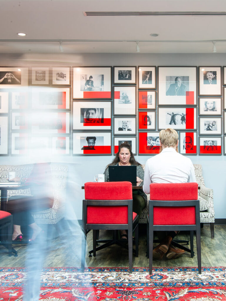
- Versa had an expansive color palette that included a beautifully vibrant red, but it was almost non-existent on the site and in their marketing collateral.
- Versa had a clean, versatile sans-serif font in their brand guide, but the serif paired with it on the website lacked the structure and attention to detail representative of the Versa experience.

For the new site design, we elevated the vibrant red from Versa’s palette and used that as the main color element through the site. The higher saturation allowed us to communicate important characteristics of the Versa brand, draw attention to important calls to action, and create paths through the site.
We replaced Versa’s original web serif, Alegreya, with Playfair Display. Alegreya can give a sort of old world feel, and its details begin to look less than polished at smaller sizes. It’s the opposite of Versa’s approachable sophistication.
The switch to Playfair Display created more structure in the headlines and allowed us to play with contrasting weights and sizes to create a clear hierarchy of information.
Though small parts of a much larger process and design plan, adjusting these two elements in a purposeful way improved the brand expression and the user experience.